Being able to convey ideas and messages through clear and direct presentations can depend not only on the approval of a project, but also the entire career. Knowing how to construct effective presentations is more than important, it’s fundamental. Are there rules? Yes; there is a base one: it is always good to remember that communication must be simple because the audience is often distracted, busy and unwilling to read complex messages. Then, the second rule is to avoid the typical errors that could make it ineffective.
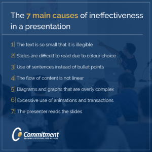
Here are 7…
- The text is so small that it is illegible
Each element of the slide must be visible to the audience who must not strain and commit to read the document, but must focus on the key message that the speaker conveys during the presentation.
Therefore, the font size under 12 characters is not recommended. The use of the characters must be oriented to clarity before aesthetics.
- Slides are difficult to read due to colour choice.
It is always necessary to keep high the contrast between the text and the background. It is necessary to attribute a weight to each colour and above all not to use more than three in the whole presentation. It is good to look for harmony in contrast but without exaggerating
- Use of sentences instead of bullet points.
Too much writing in a slide is ineffective. It is necessary to summarize the content and to represent it in bullet points. It is said that the bulleted lists should be a maximum of 3 for some, or 5 for others, but common sense advises not to fill the slide.
- The flow of content is not linear
The worst criticism that can be given to a presentation is: “You do not understand where you want to arrive, it is confusing and has no logical thread”. This creates disorientation and distraction in the audience as well as invalidating the credibility of the entire work.
It is for this reason that it is good to understand how to structure the communication within a written presentation before starting to write up the slides. The informative flow of ideas must be clear, linear and coherent.
- Diagrams and graphs that are overly complex.
The graphic parts have the objective to schematize the concepts. In the specific case of tables and graphs, they must be particularly intelligible to avoid the risk that they are interpreted incorrectly or even not fully understood. If the key concepts expressed in a chart are different, more slides will have to be created.
- Excessive use of animations and transactions
There are interlocutors who love animations in a slide and appreciate transactions between one chart and another; when, however, you are not entirely confident or the presentation is addressed to several interlocutors, it is good to avoid them because they can irritate the audience, making them become impatient when seeing too many graphic effects, distracting them from the main message you want to convey.
- The presenter reads the slides
You must provide added value compared to the charts that are presented: you should not be redundant from the content point of view, but you need to provide additional information. The slide is a visual support that reinforces the speaker’s words and that absolutely must not be the faithful copy. The audience must be attracted and curious and must perceive that their concentration is being invested in listening to the speaker and is being well repaid, or else the whole could be read independently.
Try now to review your previous presentations and look for these seven common errors. Modify them in a way that they get completely eliminated and look over the result: is there not a drastic change? Now you are ready to impress, and if you are worried that they have not got enough information, print or prepare the most important details separately and tell the audience that you will give them separately. It is more effective and professional.


